Tuesday 1 April 2014

Report (1/04/2014)

MS3 Evaluation
AO2: Apply knowledge and understanding when analysing media products and processes and evaluating your own practical work, to show how meaning and responses are created.

Word count: 500-750

Worth: 10 marks (10%)

-Knowledge of media theories/concepts
-Knowledge of history of genre, narrative and representation
-How research informs production
-Specific shots and use of language
-Refer to facts and figures
-Explain how you’ve subverted your research

Textual analysis of music videos shows women being treated as objects -encouraging teenagers to aspire being treated in the same derogatory manner. The industry encodes the message that women are beautiful, however this can be misconstrued as beauty being a woman’s only purpose. The contrast between the clothing codes of men and women exemplifies how the patriarchal industry views gender as unequal. Through the positive portrayal of being sexualised, the ideology of women being ‘used for entertainment value’ comes across. The oppositional reading of these texts is that women are used to create male sexual fantasies through distasteful objectification and sexualisation.  My research shows that women are commonly represented as strippers, prostitutes and sex objects which is juxtaposed against men who are dominant, professional and in control; I want to subvert the negative stereotypes of women in music videos.

After analysing music magazines, I found the key conventions to include bold, simple and eye-catching typography, short capitalised sentences and a rigid colour palette theme- all of which I mirrored through my own designs. On my front cover I included subject topics relevant to my investigation such as gender discrimination and using sex to sell. I used a combination of bold, italic and capitalised fonts to add to the element of shock and irregularity to reflect how ‘Plain Jane’ is different to other artists as she subverts ‘feminine stereotypes’ by denouncing misogyny and inspiring self-confidence.

I named my magazine ‘Melody’ because it’s relevant to the lexical field of music. My target audiences are teenagers and young adults (15-25) because my 50 completed questionnaires proved this age range to be the most influenced by music magazines. I wanted ‘Plain Jane’ to be a suitable role model for teenagers; therefore I designed my magazine to be classy and elegant to reflect her opposition and distaste towards the discrimination of women. This is reinforced by the mode of address which speaks to the reader through a formal and high order lexis. I used a black and white theme to encode the message that someone can look 'plain' on the outside but be very different on the inside.  

I subverted the stereotype of women being passive in the music industry by creating an artist that represents a loud female voice. One of her goals is to abolish the sexual connotations of women, which is discussed within the interview. I emphasised the red lips through high saturation because red lips are something that has connoted sex for generations- ‘Plain Jane’ questions why something so literally innocent can connote something so sexual. To encode this message further, I used an arguably ‘sexual’ pose of an extreme close up face shot on the front cover to demonstrate how sex is used as a means to sell. ‘Plain Jane’ then subverts this by denouncing objectification and sexualisation of genders. By using these subversions in an ironic way, ‘Plain Jane’ is post-modern because she blurs the boundaries of what society categorises as ‘feminine’ and ‘masculine’. The gender symbols reflect how she possesses stereotypical ‘masculine’ traits of being independent and dominant.

I used Pixlr and Photoshop to create and edit my practical work; I overcame the issue of pixilation through software called ‘SmillaEnlarger’. I am experienced with Pixlr through my AS coursework, however Photoshop was a beneficial learning curve for me. Peer assessment helped me ascertain whether or not my magazine looked successful; feedback stated that the blank spaces looked unprofessional and consequently I made amendments and filled the blank spaces with significant quotations. I used a collage of words (taken from my primary research) of how female singers are stereotypically labelled including ‘sex object’ and ‘talent’. These binary oppositions reflect how this female artist has overcome negative comments and come out as an inspirational role model for her fans. Additionally, by using irregular fonts/colours I wanted to symbolise how 'Plain Jane' is a contradiction against these stereotypes.


The music industry often equates talent and success to sex appeal; I intend people to read Melody Magazine because they want to see an artist that is different and innovative as opposed to a generic and sexualised pop artist. Examples of my subversion include clothing codes and her attitude towards self-worth; ‘Plain Jane’ wears a suit rather than being stripped down and she argues that women do not need to take their clothes off to get attention/recognition. I’ve subverted my research by creating a woman in the music industry who is in control and famous for her talent rather than her sex appeal.

750 words

Peer and teacher feedback (1/04/2014)

My classmates said that they preferred my front cover without the red banner because it looked more professional. I will therefore listen to my audience and hand in this piece:


My teacher advised me that the red and white banners looked unprofessional as they could be mistaken as 'blank space', however I have to keep them in order to make my pages equal and non-stretched as I used specific A3 measurements on Photoshop which I fear will give me printing difficulties if I alter. Therefore, I compromised, and I have made the following changes:


On the left side are the negative stereotypes of women in the music industry and on the right side are the positives which 'Plain Jane' represents. I used binary oppositions to reflect how this female artist has overcome negative comments and come out as an inspirational role model for her fans. These are words which I obtained through my primary research questionnaire.


Sunday 30 March 2014

Final pieces to print (30/03/14)

Changes to colour and layout:

When I printed my work, I found that the pages were irregular in size and did not have the correct measurements of an A3 page (images came out pixilated and stretched). Therefore, I used Photoshop to make measurement adjustments. My colour theme is red, black and white and I created irregular shapes and lines in my designs to make the magazine look more 'edgy', reflecting how Plain Jane is different to other artists. Additionally, I found irregular shapes to be a key code and convention of music magazines. Finally, I added page numbers to make the pages look professional. 
Here are the final pieces:


Wednesday 26 March 2014

Practical work

I was having major problems with pixilation. I downloaded the software 'SmilaEnlarger' and de-pixilated the text. Using Photoshop I increased the saturation of the red text to make it more bold. I also added a price to make the cover look more professional.


I wasn't happy with the text layout on my previous piece as the text was too difficult to read and not juxtaposed. I used word/Pixlr/Photoshop to edit this. I added page numbers and made the centre quotation larger.


Interview script

Plain Jane, a 24-year-old singer-songwriter from London, is the star that everyone is talking about. Having recently been voted ‘best female role model’ by RealMusic Television, her hugely anticipated album ‘Independent Woman’ did not disappoint her enthusiastic fans. Climbing up to the top of the charts, she has been likened to the controversial success of Madonna and Lady Gaga with the fresh excitement of contemporary artists like Miley Cyrus. Behind all the fame however, there’s a woman criticised and discriminated against for her body image. Plain Jane tells Melody Magazine how she receives daily hate comments on YouTube telling her she’s ‘too masculine’ and ‘not sexy enough’. Plain Jane gives Melody Magazine and our eager readers a fiery response,“Enough is enough! Stop sexualising women and likening them to voiceless objects of sex!”

Q: What’s the significance to your stage name, ‘Plain Jane’?
A: ‘Plain Jane’ is the term used about women who are categorised as unattractive and boring. It basically means ‘average’ and is a term based entirely on physically appearance and first judgments. My question is, how can you judge someone by their body and appearance when this doesn’t tell you anything about the person? I’m not one of those girls who get naked for the camera, yet I consider myself an outgoing and confident lady. I chose this name because it encapsulates the generalisations of body image by our generation. Some people may thing that I look ‘plain’ and boring on the outside, but on the inside I am strong, talented and independent- and at the end of the day, that’s all that matters.

Q: What points are you trying to get across to your fans in your recent music video, ‘Lady in a Lad’s World’?
A: I wrote ‘Lady in a Lad’s World’ to show that women are just as powerful, independent and talented as men, and also to show how the sexualisation of genders can really affect people. I decided to play the roles of both male and female characters to reflect how women can have masculine traits and men can have feminine traits- and still be beautiful. I want society’s warped image of beauty to be abolished, as well as sexualised misconceptions of women in this industry. Therefore, I challenged the objectification and sexualisation of gender through my music video. I’m not what is categorised as ‘a conventional beauty’ and people criticise me for being too ‘masculine’. So what? I love the way I look and that’s all that matters. Should I succumb to the ‘sexy’ stereotype that the media forces women in the music industry to be? No. I refuse to, and other women should do too. I chose this controversial approach because overt gender sexualisation is an issue, and I feel women in music videos are especially subjected to this.

Q: Why has your music video has caused such uproar of controversy?
A: Has anyone noticed how male produced videos are extremely suggestive? They say actions speak louder than words, and in the case of music videos, actions suggest women passively do whatever men want them to do. Women are just objectified for their bodies and barely have a voice or identity. I wanted to create a music video where the stereotypes of women’s primary purpose of being ‘sexy’ and ‘there to please’ are scrapped. We deserve to be credited for our talents rather than be objectified for our bodies and scrutinised for our sexuality. This is why my music video has caused so much controversy; people are shocked that there are no rigid gender roles or stereotypes.

Q: How have you responded to the positive/negative attention brought upon by your controversy?
A: Some people may be shocked at the way I dress and how I ‘lack feminine qualities’. I am walking proof of the fact that women don’t need to strip sown and expose their bodies to get attention in the music industry. When my producer told me I needed to take my clothes off and ‘act more sexy’ for my male fans, I fired him. I strongly detest misogyny and will do all in my power to discourage it. I’ve received lots of positive media attention by representing something new, fresh and exciting in the music industry, and I’ve also recently been voted one of the top female role model for young teenagers. Women shouldn’t be discriminated and objectified by their bodies and it’s important that young children do not grow up to be desensitised to this issue. Women shouldn’t have to feel like ‘sexual objects’. Everyone needs to be aware of the overt sexualisation of gender that takes place in the music industry, and music videos like Robin Thicke’s ‘Blurred Lines’ encapsulates this disgustingly, over-sexualised music culture.

Q: Why do you think gender roles are so defined in the music industry?
A: The representation of men and women is something that has stemmed from society ideals. Society tells us to expect people to looks/act/dress one-way or the other. You’re either categorised as completely masculine with strong muscles and flashy suits, or you’re ultra feminine and have the perfect boobs, bum and face- in that order! The music industry is so influenced by these gender stereotypes. Women, in particular, are used for their bodies to attract male audiences and producers believe that women have to dress half naked in order to receive any sort of attention or recognition as a female artist or music video dancer. Apparently if you’re not ‘sexy’ you’re not selling. This needn’t be true. In my music video, ‘Lady in a Lad’s World’, the women tale on the ‘masculine’ role, being dominating and intimidating, while the men are portrayed as weak, dumb and sexy- the typically ‘female’ stereotype. I did this to subvert how the music industry exploits gender sexuality, using it as a means to sell, and also to demonstrate how these gender stereotypes are old-fashioned and sexist. Beauty is becoming plastic and artificial because the media and music industry conform to stereotypes and unrealistic perceptions of beauty. Women are stripped of the freedom of being more than a pretty face and a sexy body.

Q: Why do you think you have been voted #1 Role Model for Teenagers in the RealMusic Television awards, 2014?

A: Through my lyrics and music videos, I discourage the objectification of genders by abolishing the overt sexualisation that you see all over music channels such as MTV and Viva! I wouldn’t want my children to grow up influenced by these overtly sexual and objectifying music videos because this leads to the backwards mindset of sexualisation/discrimination of genders being accepted and becoming ‘normal’. In the long term, this creates a shocking desensitisation to contemporary issues, for example teenagers being brought up thinking it is acceptable to take advantage of women due to their ‘purpose of being mere sex objects.’ This needs to change. The music industry needs to realise that their stereotypical and sexist misrepresentations of gender can mentally and physically affect young generations. Children look up to the people they see in music videos. I am an artist who subverts the concept of ‘using sex to sell’. My focal point isn’t my body. My focal point is my talent.

Thursday 20 February 2014

Cover page and interview spread (20/02/14)


I added a justification for the 'sexual pose'


After doing research on layout/designs of music magazines I found the key conventions to be:
  • Irregular fonts and sizes
  • Bold but simple title typography, eye-catching 
  • A colour palette theme (2-3 colours max)
  • Short, capitalised sentences
  • A 'tagline'
  • A large quotation from the main article 
I incorporated all of the above conventions into my front cover and included subject topics relevant to my investigation such as gender discrimination and using sex to sell. I used a combination of bold, italic and capitalised fonts to add to the element of shock and irregularity. I listed relatively new, upcoming artists down the right hand side of the page to make the music magazine look more official and also to create a colour contrast against the black and white background. I decided to go with a black and white theme because this represents how someone can look 'plain' on the outside but be very different on the inside. I hope to finish this article with a colourful photo shoot to visually distinguish between this comparison. Additionally, I still need to work out page numbers.

Interview spread (1st double page):

After getting some feedback from other students and my teacher, I made a few changes including justification of the red lips and colour tweaks for clarity:

Justification of red lips, colour and quotation added
Interview spread (2nd double page):

Peer assessment showed that the centre quotation was difficult to read because of my chosen colours and so I changed my colour palette. Feedback stated that there were a few blank spaces which looks unprofessional. Therefore I created a collage of words (taken from my primary research) of how female singers are stereotypically labelled. I used irregular fonts/colours to reflect how 'Plain Jane' is a contrast to all of these generalisations.


Friday 14 February 2014

Article interview layout (14/02/14)

First double page:


 These were the first two designs I created for my magazine article to help me visualise the layout of my first double page. I created the name 'HotVibes' but decided against it later on due to the similarity to Vibes (an official music magazine). I used a colour scheme of bright red, white and black to compliment the title 'Hot' Vibes and to make it look bold and exciting to readers. On one of the designs, I used silhouettes in the background which worked quite well as they are typically feminine/'sexy' poses. I like the idea of making the interview questions a different colour to the rest of the text as it looks more professional. I also experimented with the opacity of the gender symbols so that they faded into the background and became more of a subtle element. Using the rectangle tool, I created coloured boxes around my quotations to make them stand out; I did this because it is a common convention in music magazines. 
The first double page will include:
  • Semi-large photograph of the artist (extending across the page)
  • Quotations from the artist
  • Introduction to the interview (telling reader about the new artist)
  • First half of the interview
  • Name of artist in large, bold font


Step 1: I used a larger, more focal image (edited accordingly on Pixlr), centred it, and decreased the saturation. Using the lasso and crop tools, I left the lips red because it draws attention to how this part of the female body is sexualised- and this is what my artist tries to subvert. I prefer the white text against the dark background (in comparison to my last designs) as the colour contrast makes the text really stand out. I used a large 'P' to begin my opening paragraph as this is a typical layout convention within magazine articles. Also, I change the name of my music magazine to 'Melody' because it is simple yet punchy, and relevant to the target market/genre of my magazine.


Step 2: Here, I added more relevant question and answers, and laid the text out symmetrically, leaving the red lips in the centre for dramatic effect. I placed 'Plain Jane' in the top right of the page to add some dissymmetry; I used an elegant font to mirror the elegant and elevated interview answers of my artist. Finally I changed the questions to the red/peach colour to create definition and colour contrast to the article.


Step 3: This is the final layout of my first double page. I added gender symbols behind 'Plain Jane' to represent how she has masculine and feminine traits, believes in gender equality, and wanting to stop gender discrimination (links to sexualisation in music videos). I also tweaked the colours of the text and used the blur tool to really blend the background out, making the artist appear more sharp and focal. 

Second double page:


The second double page will include:

  • The second half of the interview
  • A powerful quotation by the artist (taken in context from the interview)
  • Large, close up photograph of the artist
  • The same colour palette as the previous double page


Step 1: First I placed the interview questions and answers on the left hand side of the page. I thought it would look interesting to invert the colour pattern, and therefore chose a black text against a white background. I placed black boxes around the quotation, along with large quotation marks to really dramatise the words.


Step 2: I added an image and placed it off-centre to try and make the page look more "edgy" (it didn't work and I wasn't happy with the result). Once again, I desaturated the image, and used the blur tool on the background to draw more focus to the artist. I wanted to add some sharp bursts of colour, and so changed the black boxes and interview questions to red/peach.


Step 3: I cropped the image further to get a close up shot. Using the lasso and crop tools, I made the lips bright red in colour. This creates a shocking contrast to the image which is very low in saturation. I sharpened features by using the burn tool. I decided the double page layout looked much better being on equal portions of the page (besides the centre quotation).


Step 4: This is the final layout of my second double page. For a better balance of colour across the double page, I placed a large 'P' and 'J' on the beginning and end paragraphs (representing Plain Jane's initials) and I am happy with the way the look against the white background. Finally, I added some text over the image in thick, white text to remind the reader that Plain Jane wants to shock contemporary views, and subvert the stereotype of women being sexual objects.

Sunday 9 February 2014

Layout ideas (9/02/14)

I took some photographs today and experimented with layout and typography using Pixlr


Saturday 30 November 2013

Secondary school questionnaire: Results

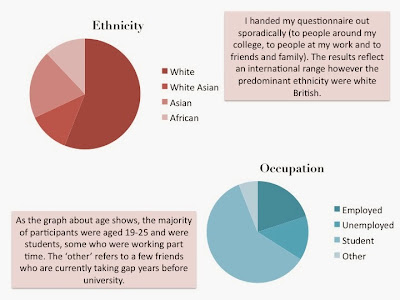
I was able to give my questionnaires to a Year 7 class of roughly 16 students. There was a lot of repetition in their answers so I condensed their feedback down into crucial, relevant data that will benefit my investigation. I think this data will add an interesting argument- I was shocked at some of the answers because the young teenagers showed a definite lack of observation in regards to the sexualisation of men and women. The dominant reaction that came across through their answers was indifference. This could represent a de-sensitisation towards moral/sexist issues from the younger generations.


Tuesday 12 November 2013

Questions for secondary school

Draft of questions:

-Who is your favourite music artist and why?

-Do you watch music videos, if so where do you watch them? (YouTube/music channels)

- Have you seen the Blurred Lines music video? What is your opinion of it?

-Have you seen Miley Cyrus’s Wrecking Ball video? What is your opinion of it?

-Have you seen Miley Cyrus's We Can't Stop video? What is your opinion of it?

-Do you think the men and women act the same in these videos? Why do you think this is?

-Write down some differences between the ways the men and women act:

Final questionnaire:


Sunday 3 November 2013

Reading Task

What I will do: 

My aim is to analyse and document secondary research through college library books and online Google books, addressing gender in the media. I will gather relevant quotations and supportive content and link them to the hypothesises within my investigation. I will try to find both supportive and challenging content to create a solid and balanced argument.

How this will benefit my investigation:

This task will help me to revise the essential key concepts of textual analysis, terminology and stereotypical gender roles. Fundamentally, the quotations that I find will be useful to incorporate into my written essay piece because they will support/challenge controversial statements.

Books of study:
  • An Introduction to theories of Popular Culture by Dominic Strinati
  • Imagining Women, Cultural Representations and Gender by Frances Bonner


Quotation:
‘Women are either absent or represented in terms of stereotypes based upon sexual attractiveness and the performance of domestic labour. In short, women are ‘symbolically annihilated’ by the media through being absent, condemned or trivialised.’ pg. 180
Meaning: 
This reinforces the notion that women are the passive gender and men are the active. This can be applied to Robin Thicke's Blurred Lines music video because there are three male singers, fully clothed, respected and dominant vs three naked women who are presented as sexual objects in the video with no other role than to look attractive and be looked at through the male gaze. This also recognises how women have become triviliased in comparison to men are considered 'beneath', 'below' or 'the other'. 

Quotation:

‘The ‘symbolic annihilation of women’ practiced by the mass media serves to confirm that the roles of the wife, mother and housewife etc. are the fate of women in a patriarchal society.'
Meaning:
Establishes female stereotypical gender roles and occupations which often regard cleaning, cooking and waiting under men (motherly and nurturing roles).This quotation recognises that this is the result of patriarchal societies because there is always a social hierarchy and women are viewed as less important than the other sex. The 'symbolic annihilation of women' refers to how society has accepted this oppressed view of women and, essentially, women's rights to hold power will always be frowned upon and considered irrelevant. 

Quotation:

Van Zoonen: ‘Numerous quantative content analyses have shown that women hardly appear in the mass media, be it depicted as wife, mother, daughter, girlfriend; as working in traditionally female jobs (secretary, nurse, receptionist); or as sex-object… It is thought that media perpetuate sex role stereotypes because they reflect dominant social values and also because male media producers are influenced by these stereotypes.’ 
Meaning:
Reiterates stereotypical/traditional/sexist female occupations which undermine their intellect. Quotation suggests that male producers do this purposely to exemplify male dominance and establish the patriarchy.

Quotation:

'This symbolic annihilation of women is confirmed by the adverts shown on television. Analyses of television commercials support the reflection of this hypothesis. In voice-overs and one-sex (all male or all female) ads, commercials neglect or stereotype women. In their portrayal of women, the ads banish females to the role of house-wife, mother, homemaker, and sex objects, limiting the roles women may play in society.’ pg. 183
Meaning:
Evidence supports the notion that there is a lack of female presence and influence in the media, in particular, in Television. The statistics used are very dated and therefore unreliable to today's media, however these statistics can be used contextually.

Quotation:
'This characterisation of women as body and emotion has been used to place women in connection with the home, the family and our supposedly caring duties.This dualistic thinking has also extended into binaries used in the evaluation of art (such as decorative or functional) which can be added to the basic dichotomies to create evaluations of women being regarded as emotional, sensuous, colourful, ornamental, derivative and decorative.'
Meaning:
The idea of women being 'decorative' and 'ornamental' connotes the message that a woman's only importance is her body image and appearance. This links to the Blurred Lines music video which has been critiqued by many viewers (and feminists) saying that the women have been used to make the video more visually pleasing. Ultimately, the women are used as sexual objects to draw in a male audience.

Wednesday 16 October 2013

Relevant article research (14/10/13)

What I will do:

My plan is to research relevant articles surrounding the controversy of Robin Thicke's Blurred Line's music video. I aim to gather a range of views and opinions in the hope of creating a balanced argument from the prospective of both male and female. Some articles are strongly feminist and others see no harm or offence in the video/lyrics). I will then summarise the key points of each artcle.


How this will benefit my investigation:

 This task is essential because, to improve my work, I need to validate the controversy within my essay piece by supporting statements through secondary research. I will convert each article into a viewable PDF file and then highlight any information which supports or challenges the hypothesis that men use women as objects within the music industry. I will then incorporate this information into my written essay.


Summary of key points:

  • Viewing audience found song sexually suggestive and unsuitable for young children who may view the advert
  • Disagreement with how women are positioned: on all fours
  • People have accused the lyrics of reinforcing rape myths, 'I know you want it' 'You're a good girl'
  • Critics say the lyrics are sexist and degrading to women
  • Beats Electronics International argue that the women featured in the ad are 'strong individuals who are not subservient to the male character'
  • Argument that the majority of the viewing audience would not find the ad offensive of overt sexual connotation
  • The ad was banned from playing before 7:30pm by the Advertising Standards Authority due to the over all tone being sexual


Summary of key points:

  • Video caused mass offence, especially from rape victims who strongly believe the lyrics validify acceptance of women objectification and abuse
  • Referred to as 'Robin Thicke's new rape song'
  • Anger caused by the idea of 'blurred lines' and not giving sexual consent (reenforcing connotations of rape)
  • Offence at 'not safe for work', naked models used in the videos. Video was banned from YouTube for obvious nudity
  • The unrated version has 50 million views whereas the rated version only has 500,000 views
  • Overtly provocative and makes some female listeners uncomfortable
  • Connotes the idea that men think that 'no means yes'
  • Mentions the Beats Electronic International banned ad and how it gained 30% disapproval on YouTube
  • Quotations from Thicke saying he has always respected women (reinforced by infro given about his wife and children)
  • He claims he only wanted to have fun in this video


Summary of key points:

  • I thought this article was interesting because Miley Cyrus was completely attacked for her performance at the 2013 VMA's, and critics seemed to unjustly disregard Robin Thicke's involvement
  • Double standards- men's provocative behaviour acceptable but not women's, 'no one cares about the man'
  • Miley claims that Thicke knew exactly how the performance would play out through rehearsals, and yet he denies this in recent interviews by calling her behaviour 'unexpected'
  • Makes the women look in the wrong, and the man in the right
  • Women's provocative behaviour being more socially unacceptable in comparison to men's

Friday 11 October 2013

Moving image terminology: recap and revision task

Key terms

Cinema Verite: A candid-camera style of filmmaking using hand-held cameras, natural sound, grainy high-contrast black-and-white film, and the appearance of no rehearsal and only basic editing.

Cinematographer: The person who supervises all aspects of photography from the operation of cameras to lighting.

Mise en scene: The arrangement of visual compositional elements and movements within a given space. In movies, it is defined by the frame that enclosed the images. Cinematic mise en scene encompasses both the staging of the action and the way it's photographed.

Sequence: A structural unit of a film using time, location, or some pattern to link together a number of scenes.

Composition: The placement of people or objects within the frame and the arrangements for actual movements within the frame or by the camera.

Colour Palette: A limited number of specific colours used or emphasised throughout the film to subtly communicate various aspects of character and story to the viewer.

Motifs: Images, patterns, or ideas that are repeated throughout the film and are variations or aspects of the major theme.


Audio 

Ambient Sound: Sounds natural to any film scene’s environment.

Voice-over Narration: The technique of using an off-screen voice to convey necessary background information, fill in gaps in the narrative, and comment on the action.

Diegetic Sound: Sound whose source is visible on screen/implied to be present by the action of the film

Non-diegetic Sound: Sound whose source is neither visible on the screen nor implied to be present in the action

Contrapuntal Sound: A term which refers to sound which does not 'fit' with the scene or image

Camera shot

Dolly Shot: A moving shot taken from a dolly. A Dolly moves the camera toward the subject, while a Dolly-Out moves the camera away from the subject. A dolly shot creates a sense of movement through space by capturing changes in perspective.

Tracking shot: A shot in which the camera is pushed horizontally along the ground on a dolly. 

Pan: A shot in which a stationary camera turns horizontally, revealing new areas.

POV shot: A shot which is understood to be seen from the point of view of a character within the scene.


Transition
Dissolve: A method of making a transition from one shot to another by briefly superimposing one image upon another and then allowing the first image to disappear. A dissolve is a stronger form of transition than a cut and indicates a distinct separation in action. 

Fade: A transitional device in which either an image gradually dims until the viewer sees only a black screen (Fade-Out) or an image slowly emerges from a black screen to a clear and bright picture (Fade-In). A fade provides a strong break in continuity, usually setting off sequences.

Wipe: A transitional device in which one image slowly replaces another by pushing the other out of the way.

Cross-cutting: The alternating of shots from two different sequences, often in different locales, suggesting that they are taking place at the same time.

Jump Cut: An instantaneous cut from one action to another, at first seemingly unrelated, action. Jump cuts will usually call attention to themselves because of the abrupt change in time and/or place.

Match Cut: A cut intended to blend two shots together unobtrusively (opposed to a Jump Cut). Also known as a graphic shot.

Flashback: A segment of film that breaks normal chronological order by shifting directly to time past. Flashback may be subjective (showing the thoughts and memory of a character) or objective (returning to earlier events to show their relationship to the present).

Montage: (dynamic editing, expressive montage, conditional montage) A method of putting shots together in such a way that dissimilar materials are juxtaposed to make a statement. 

Camera Angle

High-Angle Shot: A shot taken from above a subject, creating a sense of "looking down" upon whatever is photographed.

Low-Angle Shot: A shot taken from below a subject, creating a sense of "looking up to" whatever is photographed.

Bird's-eye View: A shot in which the camera photographs a scene from directly overhead.

Reaction Shot: A shot showing one or more characters reacting to an action or statement. 

Zoom Shot: A shot accomplished with a lens capable of smoothly and continuously changing focal lengths from wide-angle to telephoto (zoom in) or telephoto to wide-angle (zoom out).